MyWit
Over the summer of 2018, I interned at Assurant, an insurance company based in Atlanta. MyWit.com is an online e-commerce store run by Assurant that sells used phones and tablets. In this project, I was in charge of redesigning the site, primarily focusing on a new resource center as the first step of the redesign. I also reworked the information architecture of the site by reorganizing the navigation bar, and reimagined the site's visual design while staying within stakeholder constraints.
My Role
- In charge of the MyWit redesign effort.
- Engaged with multiple stakeholders to align design process with marketing strategies and concerns.
- Conducted user research to optimize design decisions.
- Iteratively created low-fidelity wireframes and high-fidelity prototypes.
Team Members
This was a solo project.
On This Page
Problem
A company's side projects often do not receive the same time and resources devoted to its main product line. Arguably, such is the fate of MyWit.com — an e-commerce site run by Assurant that sells used phones and tablets. Sales have been underperforming since the inception of the site. In fact, given the large inflow of used devices sourced from Assurant's mobile suppliers, our data team estimates that our current revenue is only a fifth of our potential revenue. There is also a general consensus among our team that MyWit performs poorly on all 3 measures of branding, usability, and aesthetics.
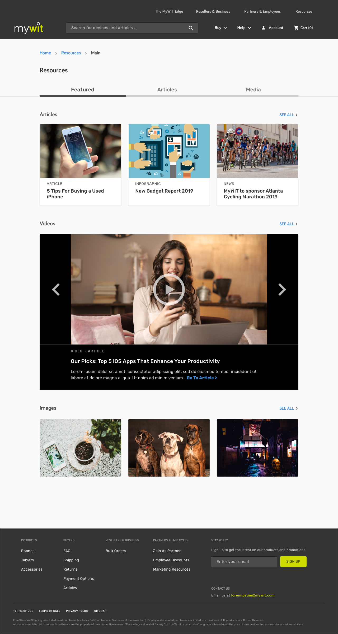
New Resource Center
As part of the new efforts to improve MyWit.com, the product owner had plans to develop a new resource center for the site. This resource center would:
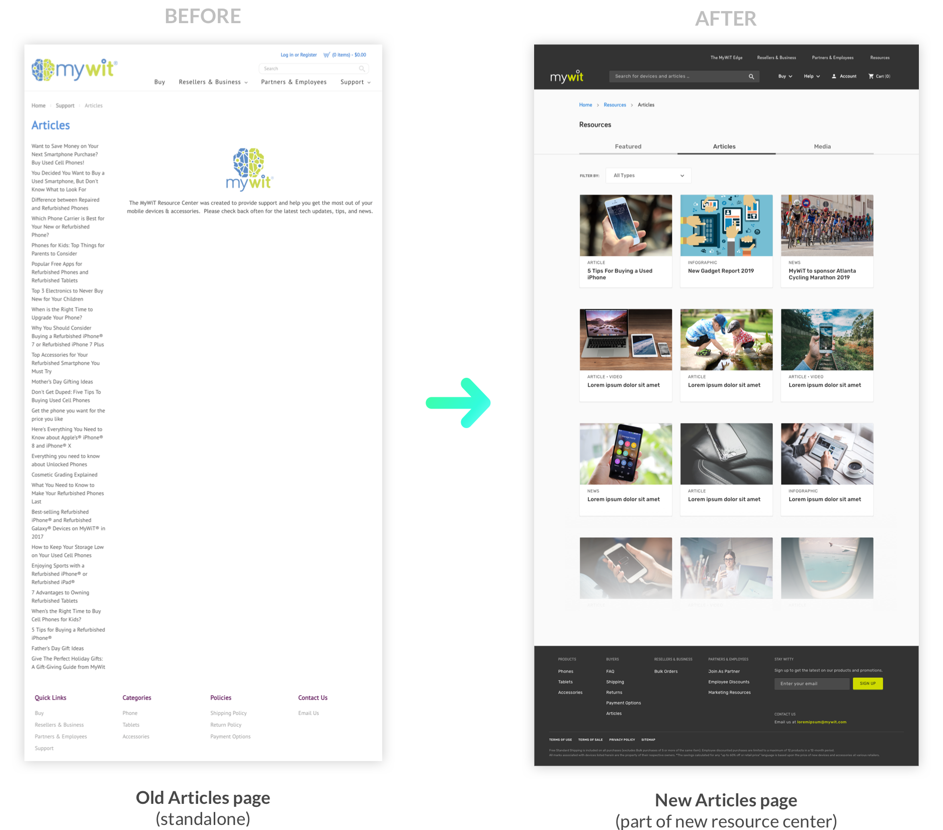
- Replace the old "Articles" page on the site.
- House traffic generating resources created by the marketing department, including articles, buying tips, and tech news.
- Serve as the future homeground for the site's partner's and suppliers, housing the MyWit logo, images, and other media.
The new resource center would be integrated into the current site, and related pages would be changed. Its design would then serve as a launchpad for an future overhaul of the rest of the site.
I was put in charge of leading this redesign effort, which ultimately spanned the last 4 weeks of my internship at Assurant.
Gathering Requirements
Requirements were primarily gathered through discussions with the product owner, the developer in charge of the site, and colleagues from the marketing department who bad been charge of MyWit.
Baby Steps
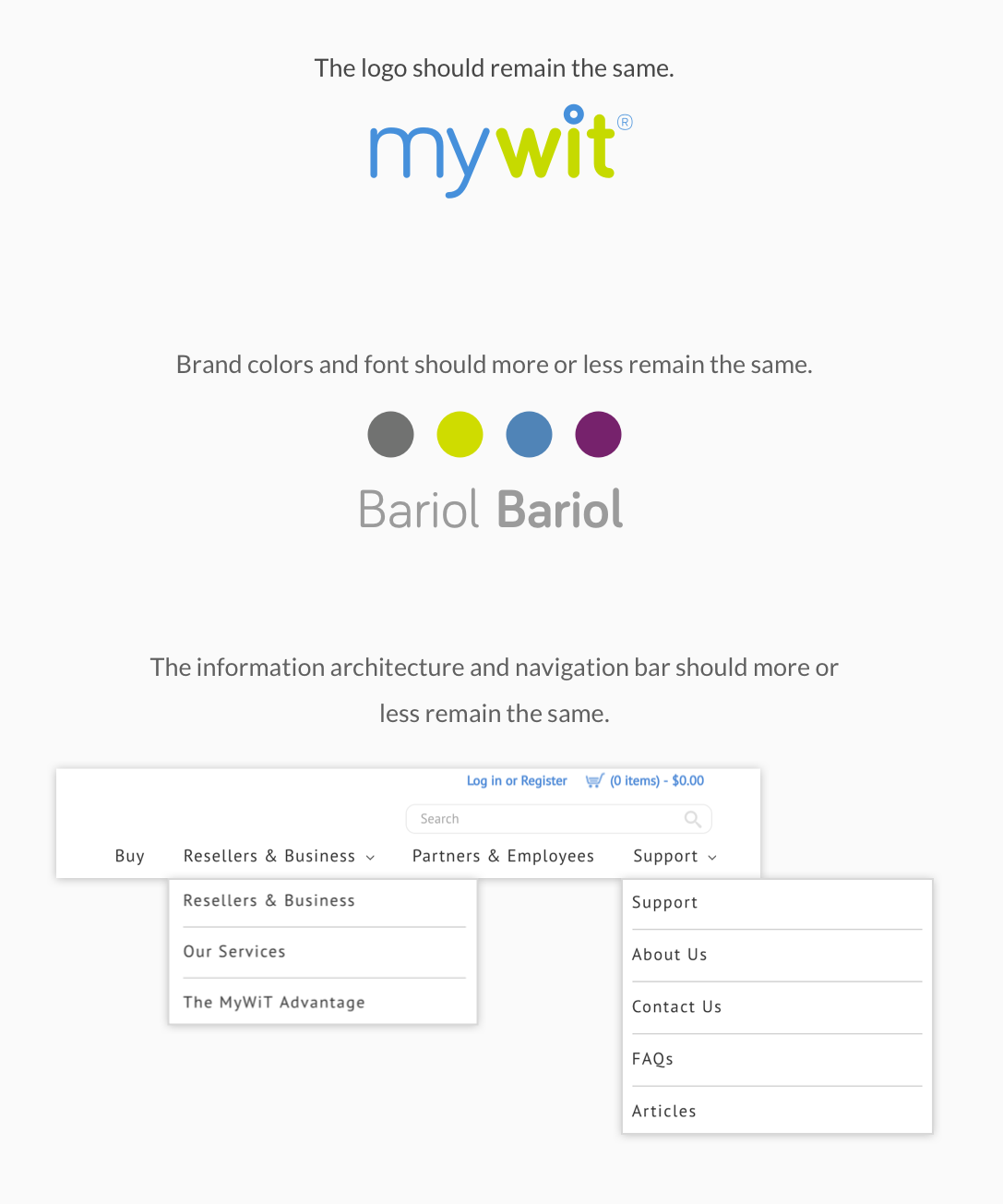
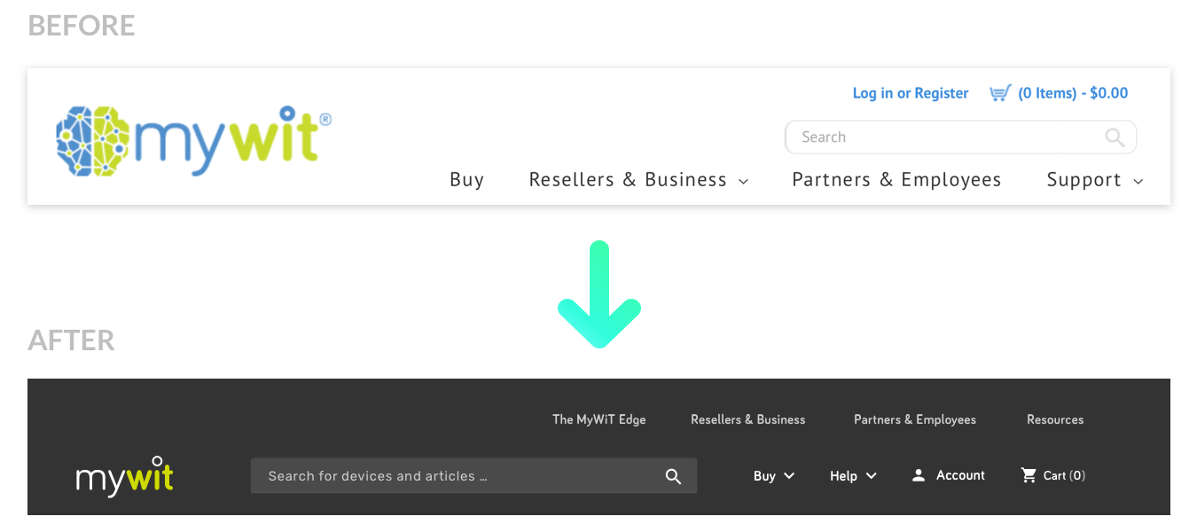
My first instinct was to design new brand standards and an improved design system for MyWit. However, after a few in-depth discussions with the product owner, we agreed that it would be better to take baby steps and limit changes to the existing brand standards at this stage.
User Research
While my initial work was primarily focused on the resource center, I performed user research on the MyWit site as a whole. I thought this would (1) allow me to gain a better understanding of the big picture on MyWit's underperformance, and also (2) facilitate the ultimate goal of improving MyWit. The resource center is not a singular entity but is an idea that would be interwoven with the rest of the site.
Contextual Interviews
I began by conducting interviews to see overarching problems with MyWit. This was really useful in helping me decide how to restructure the site's information architecture when interweaving the new resource center into the site.
Interview Findings
The site felt dated and unprofessional — One user noted that it felt like "one of those scam websites".
Difficult to understand what MyWit was — The logo and branding confused users as to what the purpose of the site was for.
No confidence on where the devices came from — Users could not easily find out how these devices were inspected or graded. The articles that would quell these doubts were buried deep in the information architecture.
No idea resources even existed on the site — Even when I told users that resources existed, they could not find the Articles page.
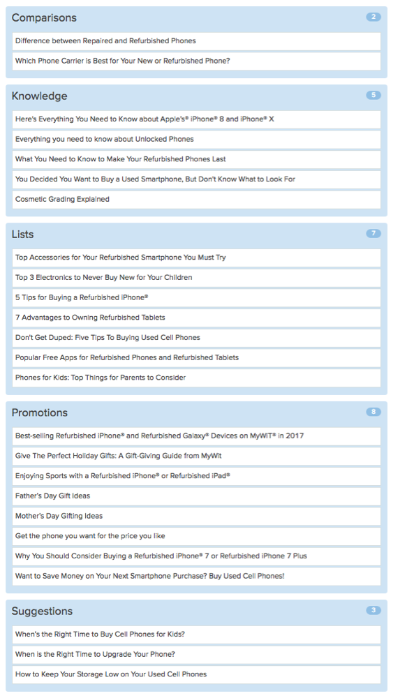
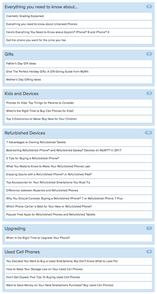
Card Sorting
One of the main purposes of the resource center was to house old articles from the old Articles page. To explore how I could classify these articles, I performed a card sorting exercise with designers in the office.
Wireframes
The resource center was not just a singular entity on its own, but rather multiple components interwoven into the site. For example, the resources for consumers may be scattered across different menus, while resources for partners may be housed in an entirely separate part of the site. Specifically, resources for three distinct user groups must be addressed: consumers, partners, and resellers.
Consumer Resources
The main page for the resource center targets everyday consumers who might want to purchase a device from the site, or who are just passing by to access a resource.
While I initially explored different ways to categorize articles, I ultimately decided on categorizing with media type instead. This is because the marketing department does not plan to add too many more articles in the future. Instead, it was more important to add different types of content, such as videos and images.
Partner Resources
Resources for partners and employees for MyWit. These users are entitled to special discounts and promotions, as well as unique resources. They may share the same resources as the consumer group.
Reseller Resources
Resources for resellers and businesses who might either want to sell used devices to MyWit, or buy in bulk. They may share the same resources as the consumer group.
High-Fidelity Prototype
Through many iterations and constant feedback from stakeholders, I constructed the high-fidelity prototype using Sketch. The new resource center features a simple interface that not only houses existing articles, but allows the marketing department to post images and video as well. It is directly assessible through the redesigned navigation bar. Check out the InVision prototype here!
Information Architecture Changes
Since the resource center is scattered across different sections of the site, I took the chance to reorganize the information architecture of the site.
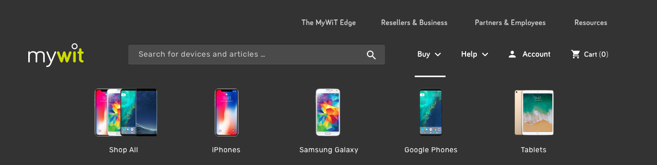
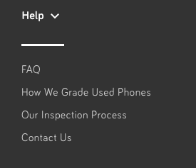
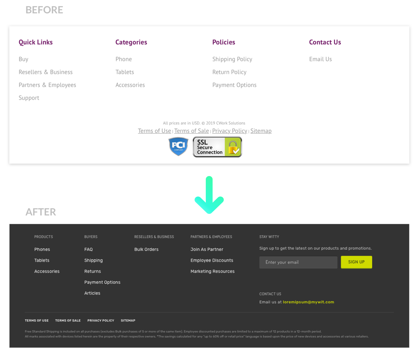
Main Resources (For Buyers)
The main page for the resource center targets everyday buyers and consumers who might want to purchase a device from the site, or who are just passing by to access a resource. Specific important articles such as Phone Grades and FAQs get their own direct links under the Help section in the navigation bar.
Partner Resources
Resources for partners and employees for MyWit. These users are entitled to special discounts and promotions, as well as unique resources. They may share the same resources as the consumer group.
Discussion
My final deliverable was well received by the product owner, and received positive feedback from other UX designers in the team. The main section of the resource section also received positive feedback from colleagues who tried to use it. At of the time of writing, the design has been partially implemented on the site.
However, my time was ultimately limited to 4 weeks, including learning about MyWit and gathering requirements. I focused most of my efforts on the main part of the resource center — consumer resources. While I was able to conduct user research on the consumer and partner personas, I did not do so for the reseller persona. Therefore, designs for the reseller resource center mainly came from iterative discussions with the marketing team in charge. If I had more time, I would conduct contextual interviews and validate my design with resellers through usability testing.